Recently I heard that Arc from The Browser Company got Windows support with tab sync, so I decided to give it another try! It’s super convenient being able to switch between Windows and Mac and have the same tabs! It’s nice not having to jump through hoops to send links anymore because the tab is already there!
After that I did some research to learn about the best way to use Arc, and I learned that you’re supposed to find some web apps you like and pin them to the top of your sidebar. This got me thinking about Apple Notes! It’s really convenient from my Mac and iPhone, but it’s really annoying to use in Windows! I have to log into the website and then sit through the Advanced Data Protection delay every time!
So then I started looking into note taking apps and found Workflowy! It looks really cool! I like how the idea is that the entire app is just a huge bullet point list, and all of your notes are just zoomed in views of part of the list! Workflowy Basics has some really nice gifs that explain this better than I can! Workflowy is entirely browser based, so it fit into Arc really well.
…so then I decided to try Obsidian! I was about to tell my friend about Workflowy when I remembered that they told me about Obsidian a long time ago, but I had never seriously looked into it because I was happy with Apple Notes at the time. I was really surprised when I discovered that their underlying storage mechanism was just… a folder of plain text markdown files!
I was kind of frustrated with Apple Notes because it only offers PDF note exports, and a bit concerned about Workflowy storing all my notes on the cloud when it’s not even a big company like Apple, so the idea of just having my notes in a folder was pretty appealing to me! In fact, it worked out really well because sometimes I need to take notes about VRChat stuff, so I’ve been taking notes too with Sublime Text and… a folder of plain text markdown files!
So I guess I already have an Obsidian vault! Now I’m going to try an app that was specifically designed for it! ✏️
My original plan was to make this my creativity blog, but I haven’t been sketching much lately. I’m still interested in learning how to draw, but I haven’t had the motivation. It might be time to expand my scope and blog about some other hobbies! ✏️
Things have been a bit different since I first joined micro.blog! X seems to have settled down a bit, and I’ve mostly tamed my algorithm, so I’m using it more actively again. I’ve also started retweeting things and trying to be more social there! So it might be time to start writing longer posts about my hobbies? Or maybe this will be my last post! Hopefully not!
Lately I’ve been playing video games and watching anime with my new Apple Vision Pro. It’s been a while since I did either of those things, so it’s nice to revisit some of my past hobbies. It seems that Crunchyroll and Funimation merged recently, which is nice for increasing the amount of shows I can watch, but there’s still too much stuff I want to watch that’s on other services! I don’t really want to subscribe to Netflix or some other service just to be able to watch a couple more things. At least there’s still a couple of nice things to watch on Crunchyroll! I’ve been enjoying Frieren and ’Tis Time for “Torture,” Princess!
One of the reasons I wanted to learn how to draw was to have cute pictures of myself, but it takes a lot of effort to get better! I’m more exhausted from work lately so I’ve started seeing more value in just relaxing during my downtime. So last year I put together a reference sheet and started requesting artwork on Skeb! It’s great! I get to see a lot of cute pictures of myself that look much better than what I could do and also support artists I like at the same time!
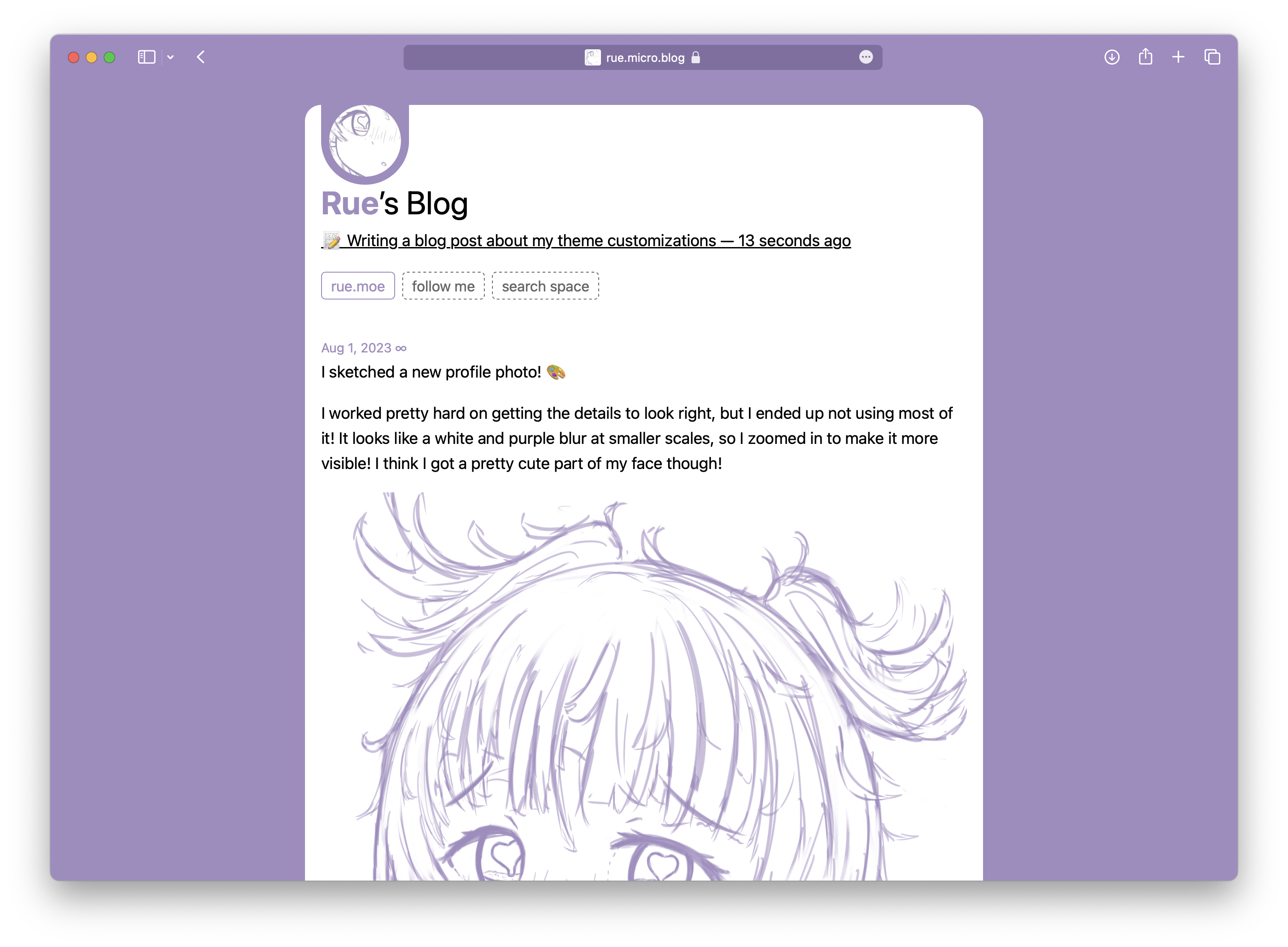
I’m really happy with my theme customizations! I wrote the CSS myself! 📝
When I first started blogging, I planned to just pick a theme and use it, but I really couldn’t help tweaking it to match my website. I think it looks quite different now while still retaining that Tiny Theme feel!
